Lecture 05: Visualizing Distributions
2/7/23
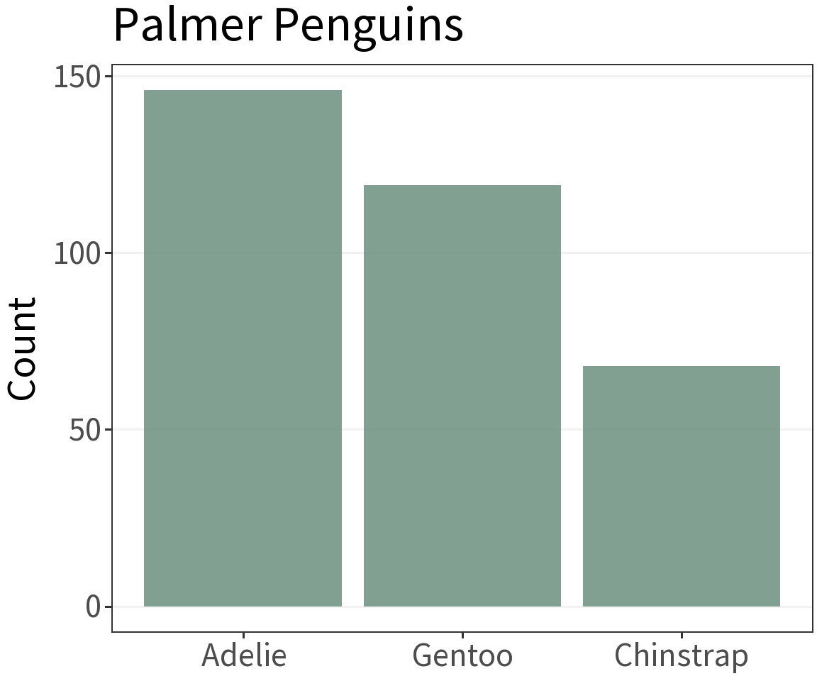
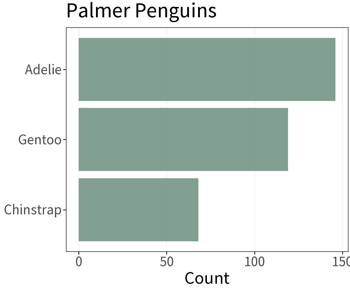
A rule of thumb 👍
Often easier to read when oriented horizontally.
Grouped data
Grouped bar chart can represent higher dimensional data.
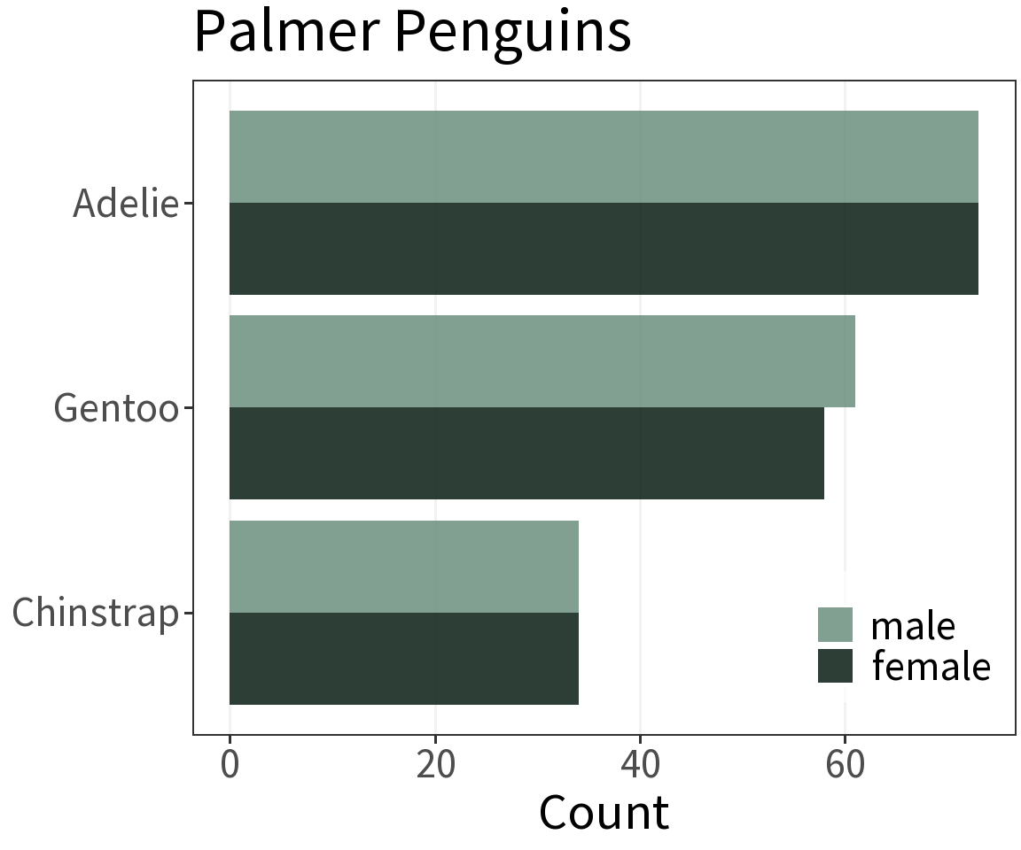
Although this graph is not terribly informative…
What’s it for?
Visualize the approximate distribution of a continuous random variable.
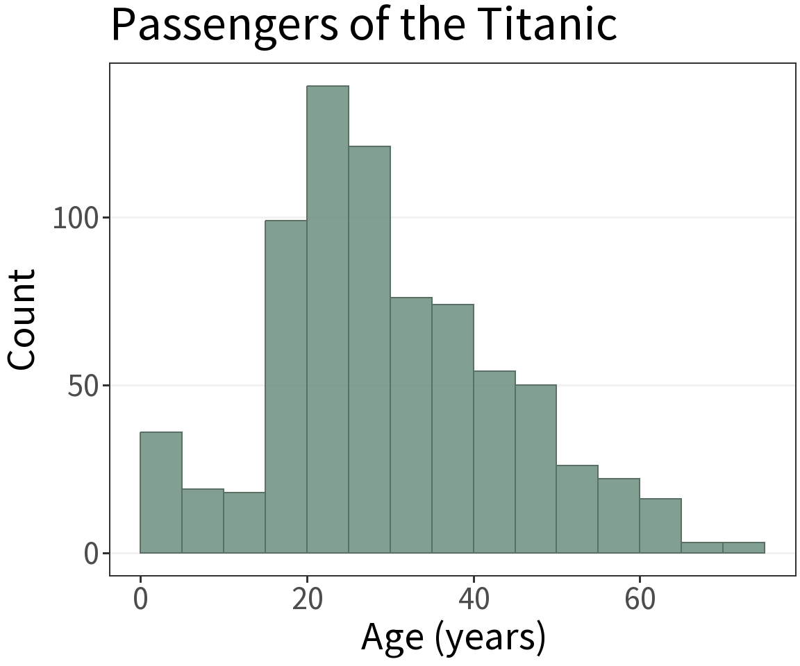
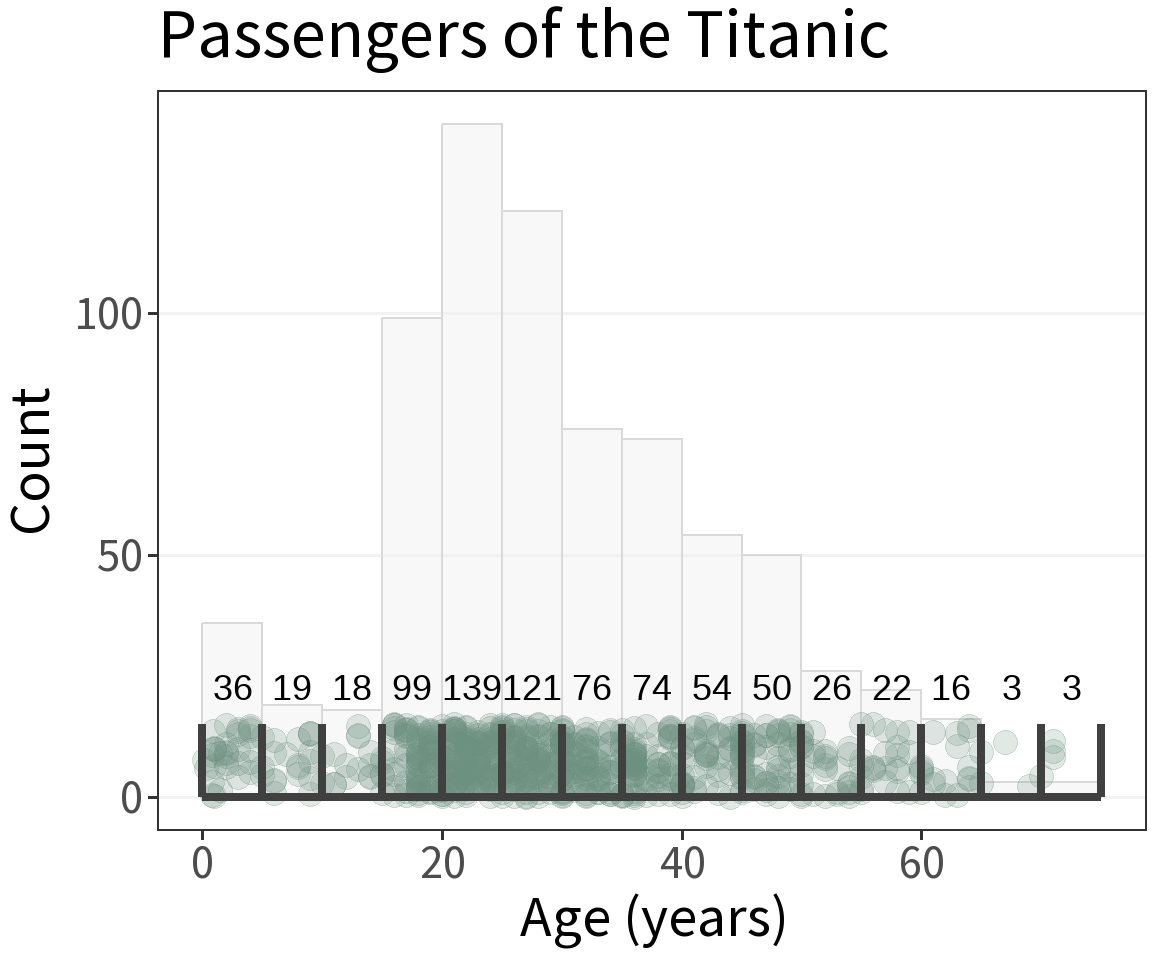
Bin Width
Obtained by counting the number of observations that fall into each interval or “bin.”
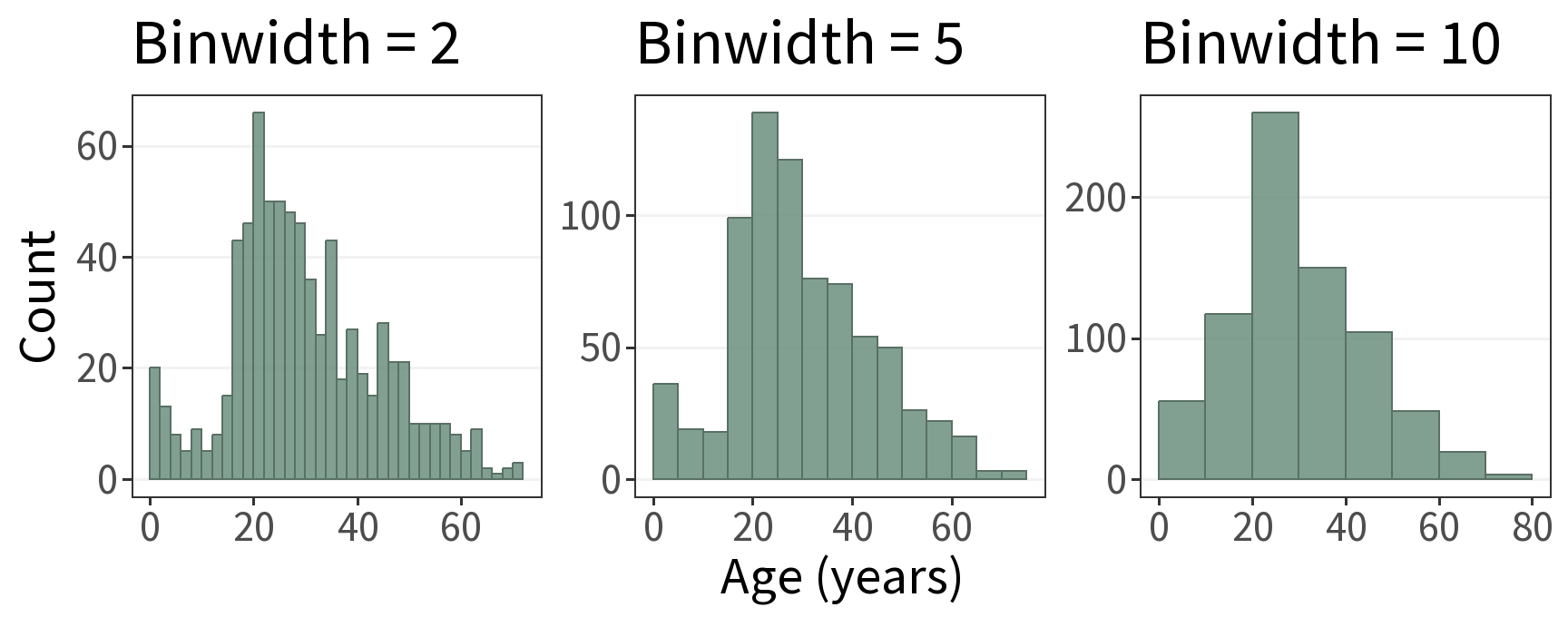
⚠️ Lookout!
The shape of the distribution depends on the bin width.
A rule of thumb 👍
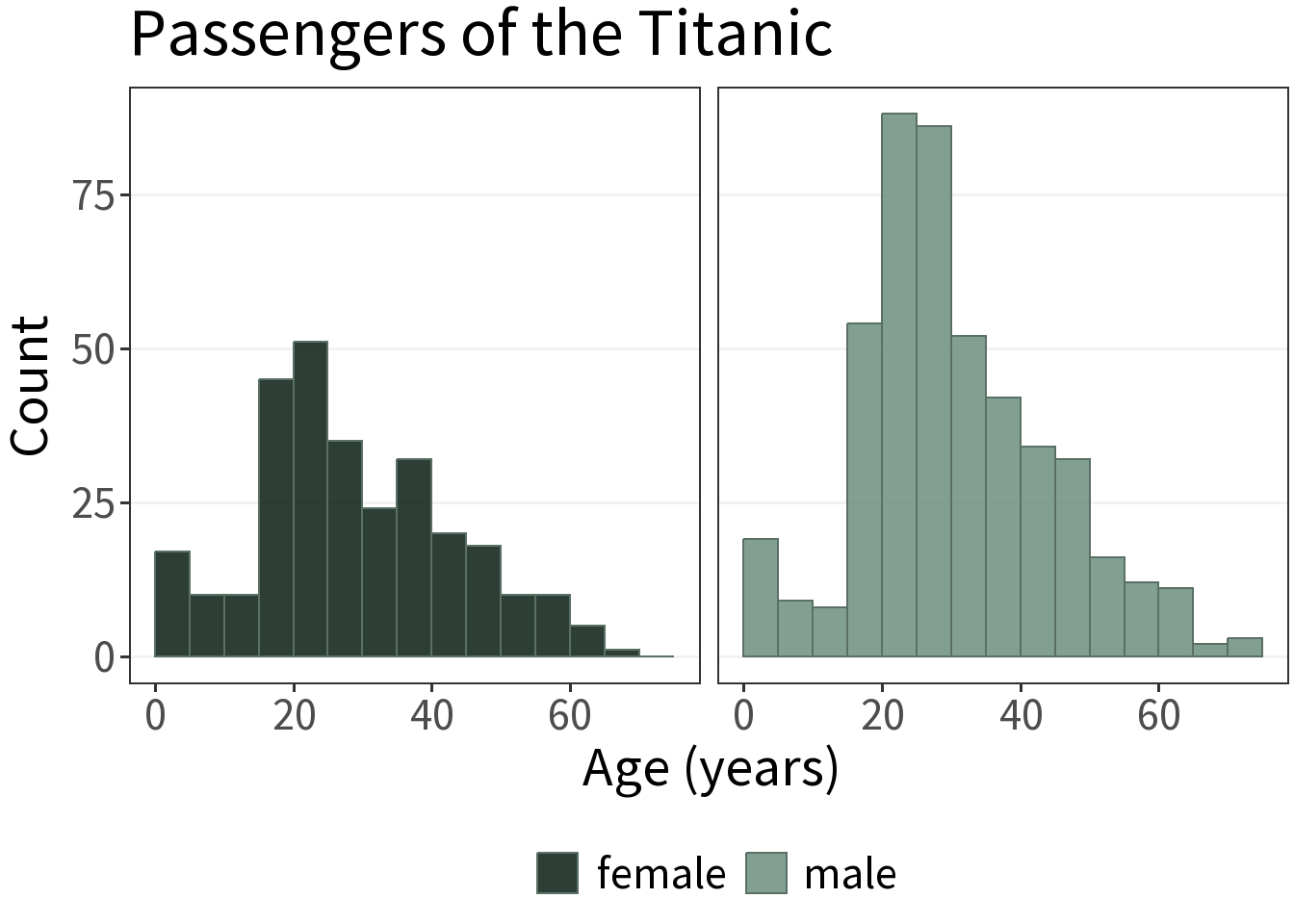
Generally, a bad idea to use stacked or dodged groupings in a single histogram.
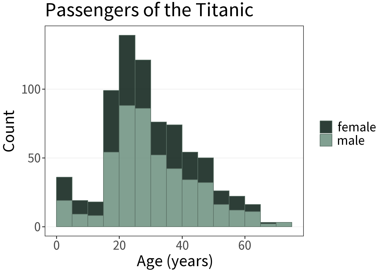
Better to use facets.
What’s it for?
Visualize the approximate distribution of a continuous random variable.
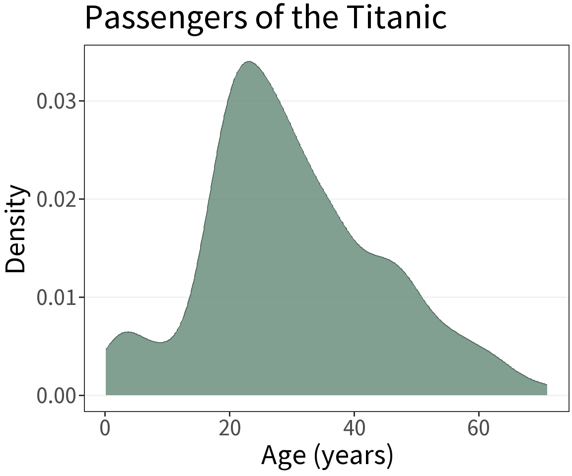
Kernel Density Estimation (KDE)
Procedure:
- Define a kernel, often a normal distribution with mean equal to the observation.
- Define bandwidth for scaling the kernel.
- Sum the kernels.
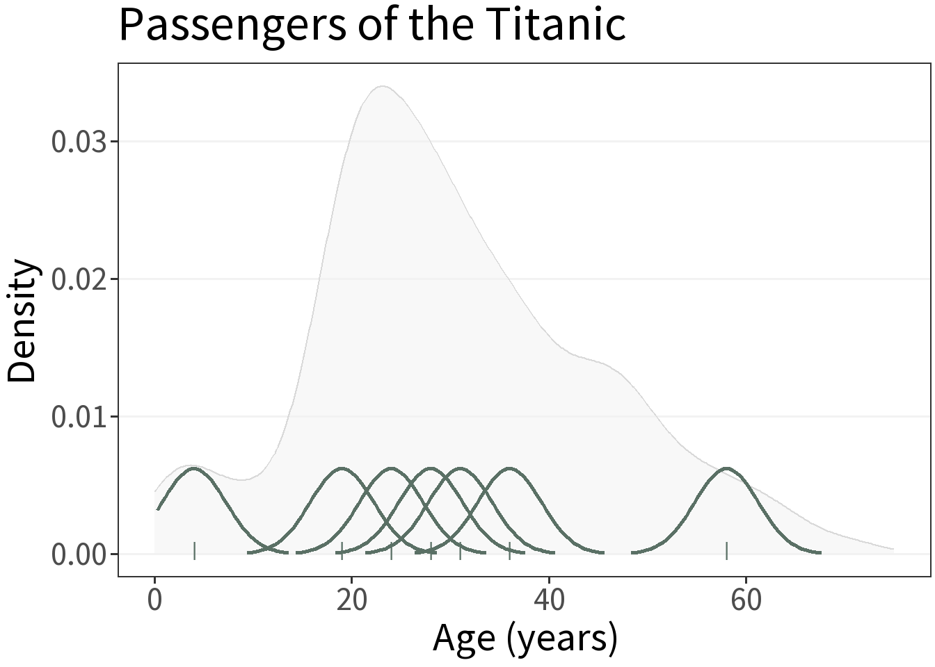
The kernels in this figure are not to scale.
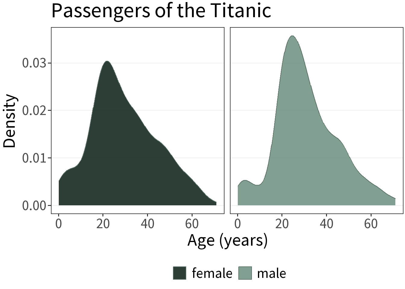
Grouped data
There’s not a simple answer for how to plot multiple KDE’s, but facets are your friend.
What’s it for?
Visualize the approximate distribution of a continuous random variable without having to specify a bandwidth.
Procedure
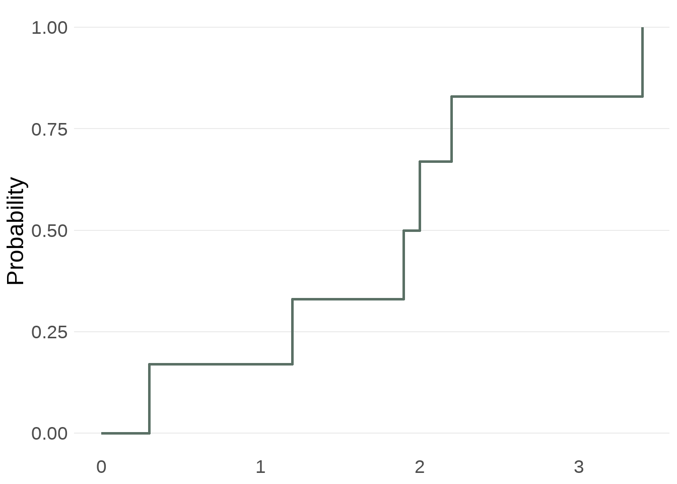
Consider this sample:
(0.3, 2.0, 3.4, 1.2, 2.2, 1.9).
To calculate its eCDF, we divide the number of observations that are less than or equal to each unique value by the total sample size.
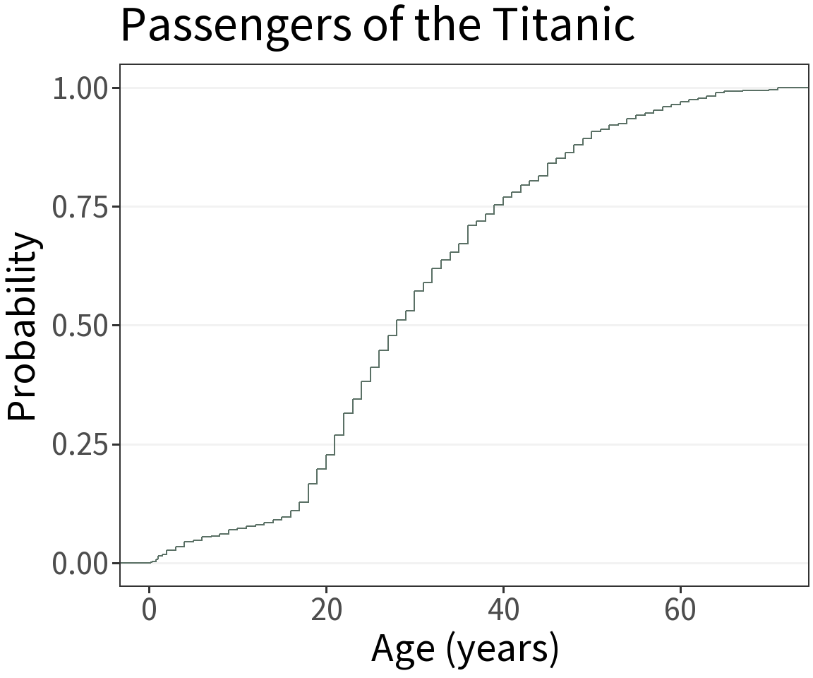
⚠️ Lookout!
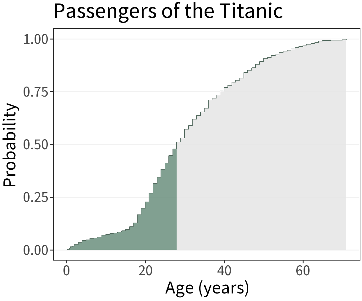
These are a little bit harder to interpret. Gives the probability of being less than or equal to x. E.g., the probability of being 28 years old or younger is 0.5.
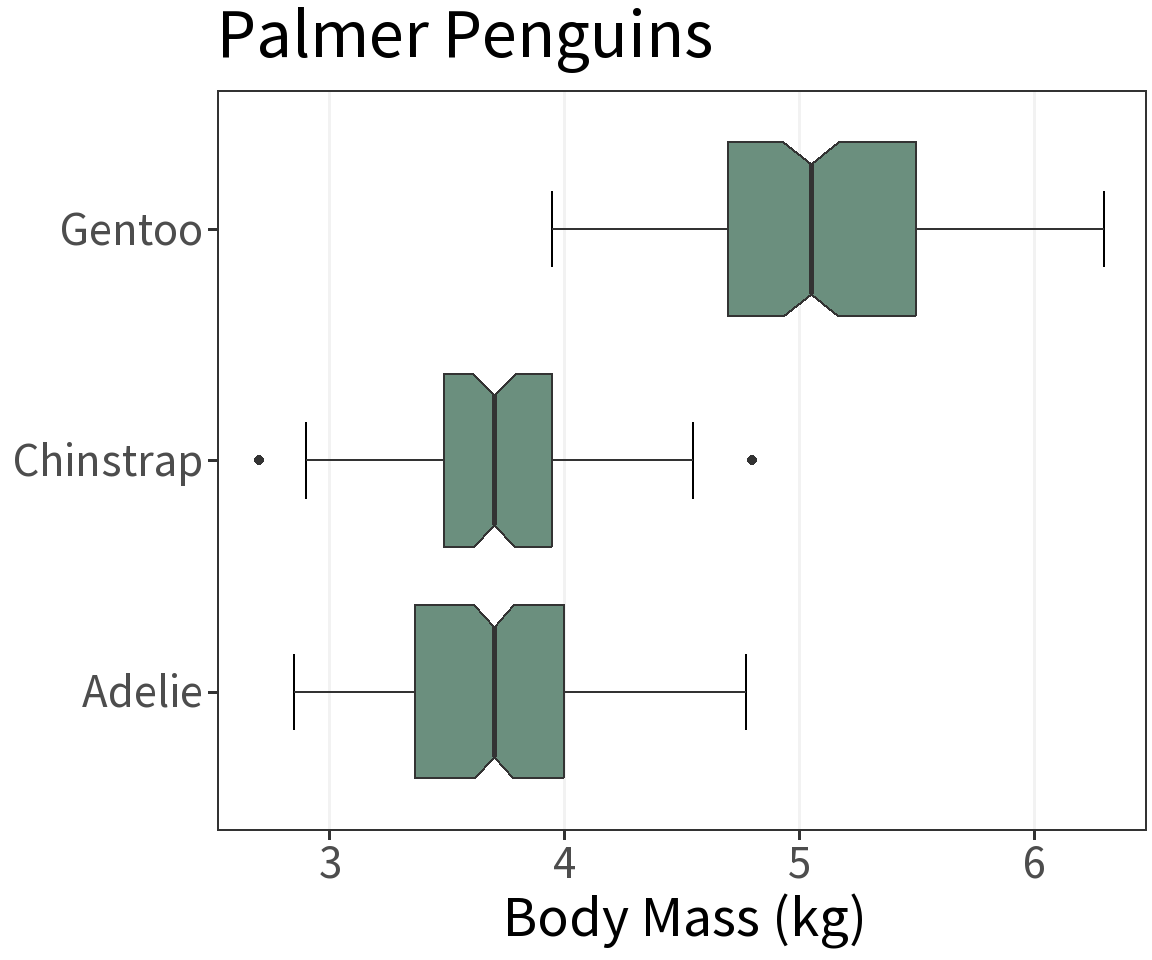
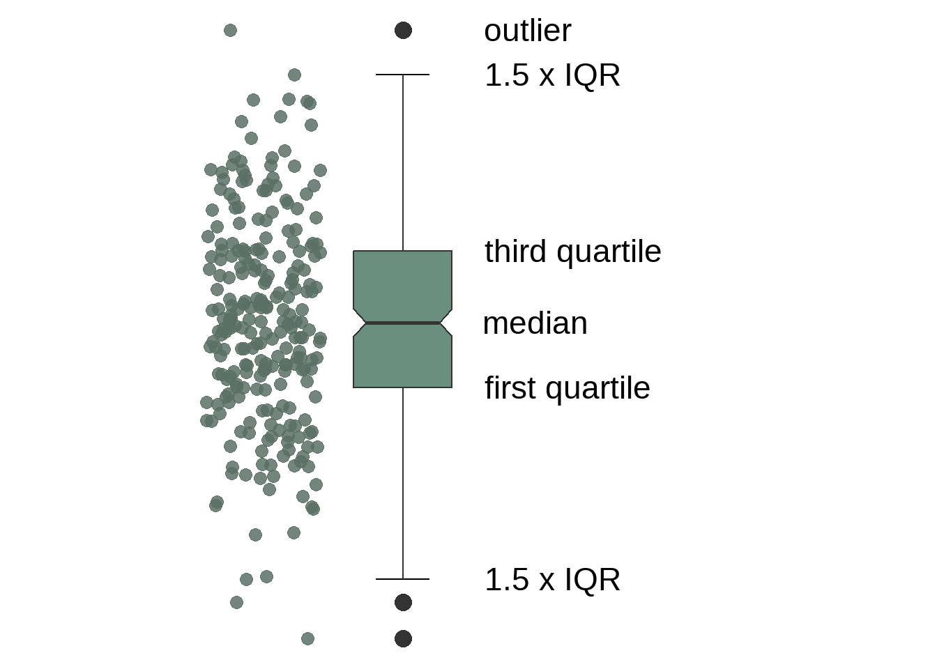
What’s it for?
Visualize the approximate distribution of a continuous random variable using its quartiles.
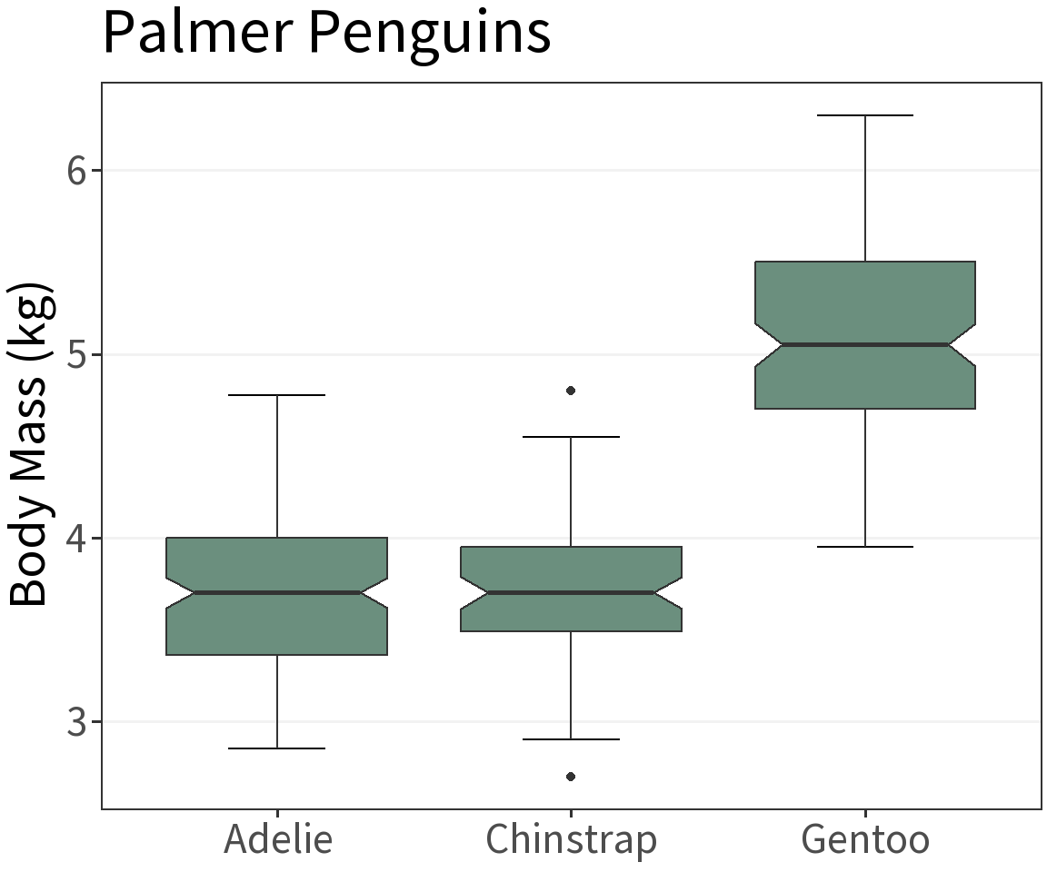
Useful for plotting distributions across multiple groups.
Quartiles
When the data are ordered from smallest to largest, the quartiles divide them into four sets of more-or-less equal size. The second quartile is the median!
A rule of thumb 👍
Sometimes easier to read when oriented horizontally.